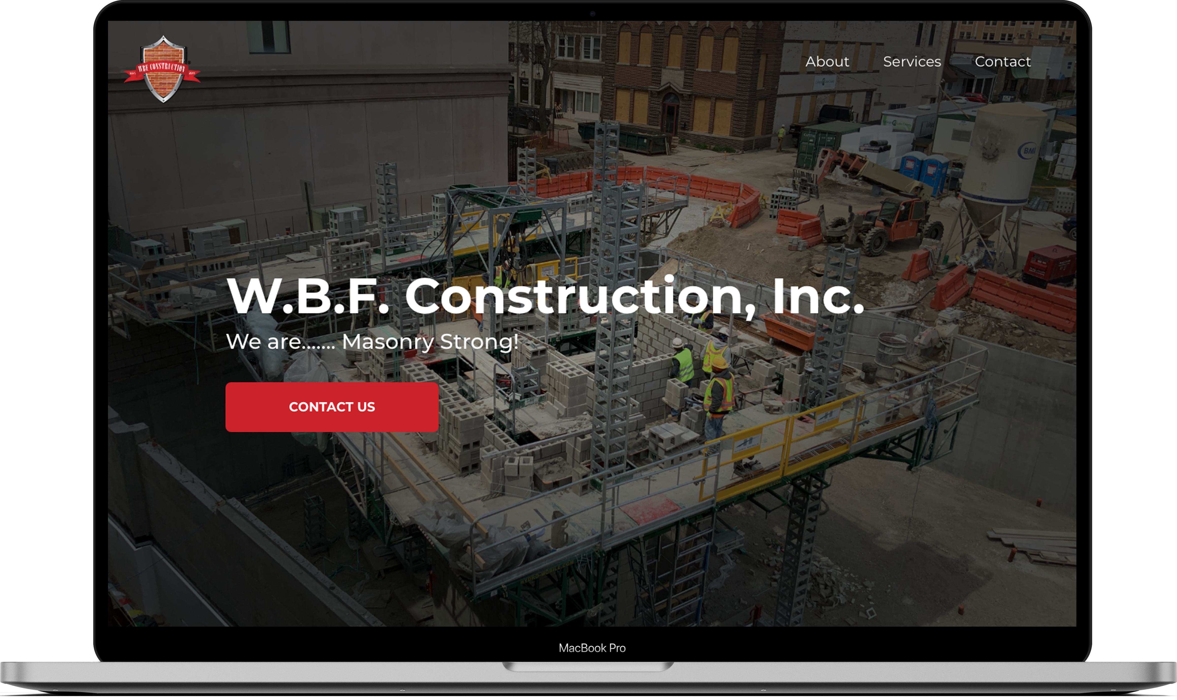
W.B.F. Construction, Inc. is one of the premier masonry contractors in the Chicagoland area. With more than a decade of experience, they have proven to be reliable and trustworthy. They have also been recognized for their superior craftsmanship – all the essentials to make their clients’ construction projects successful. With 25 years of masonry expertise, W.B.F. Construction, Inc. is a contractor that specializes in new masonry, restoration, and repair of brick throughout the Chicagoland area.
Headquarters
Evergreen Park, Illinois
Industry
Masonry, Construction, Production of Goods
Services Provided
Website Design & Development
The Goal
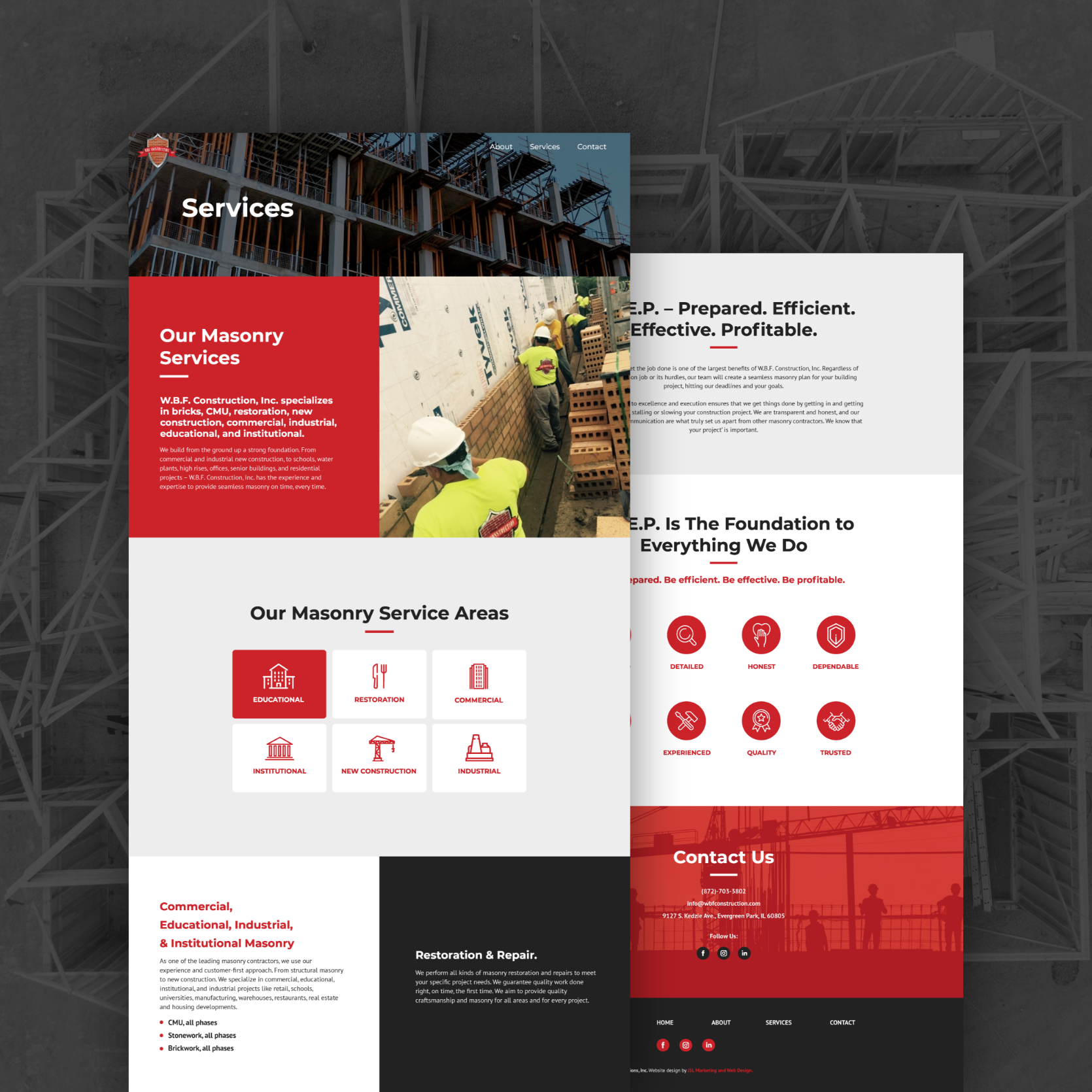
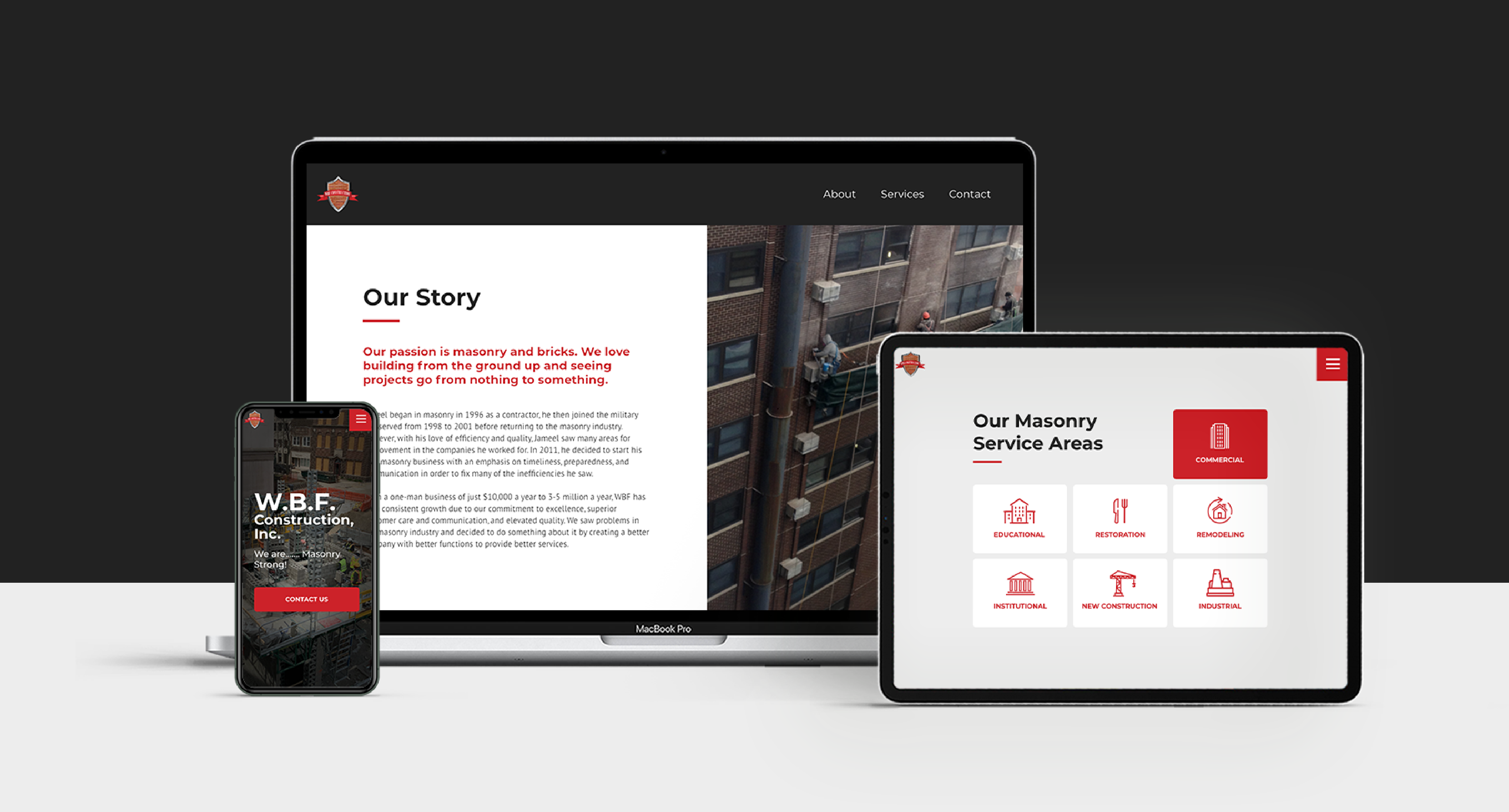
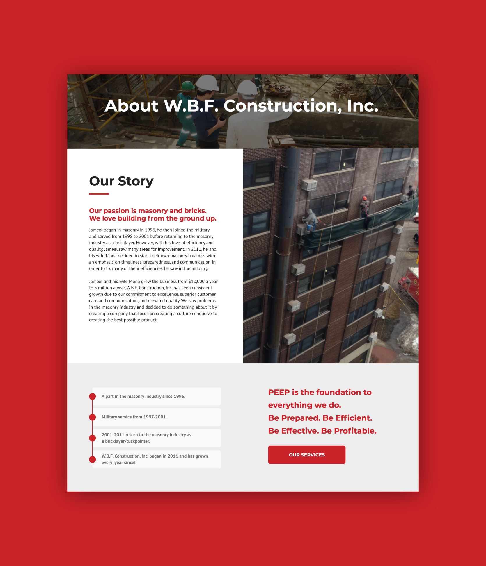
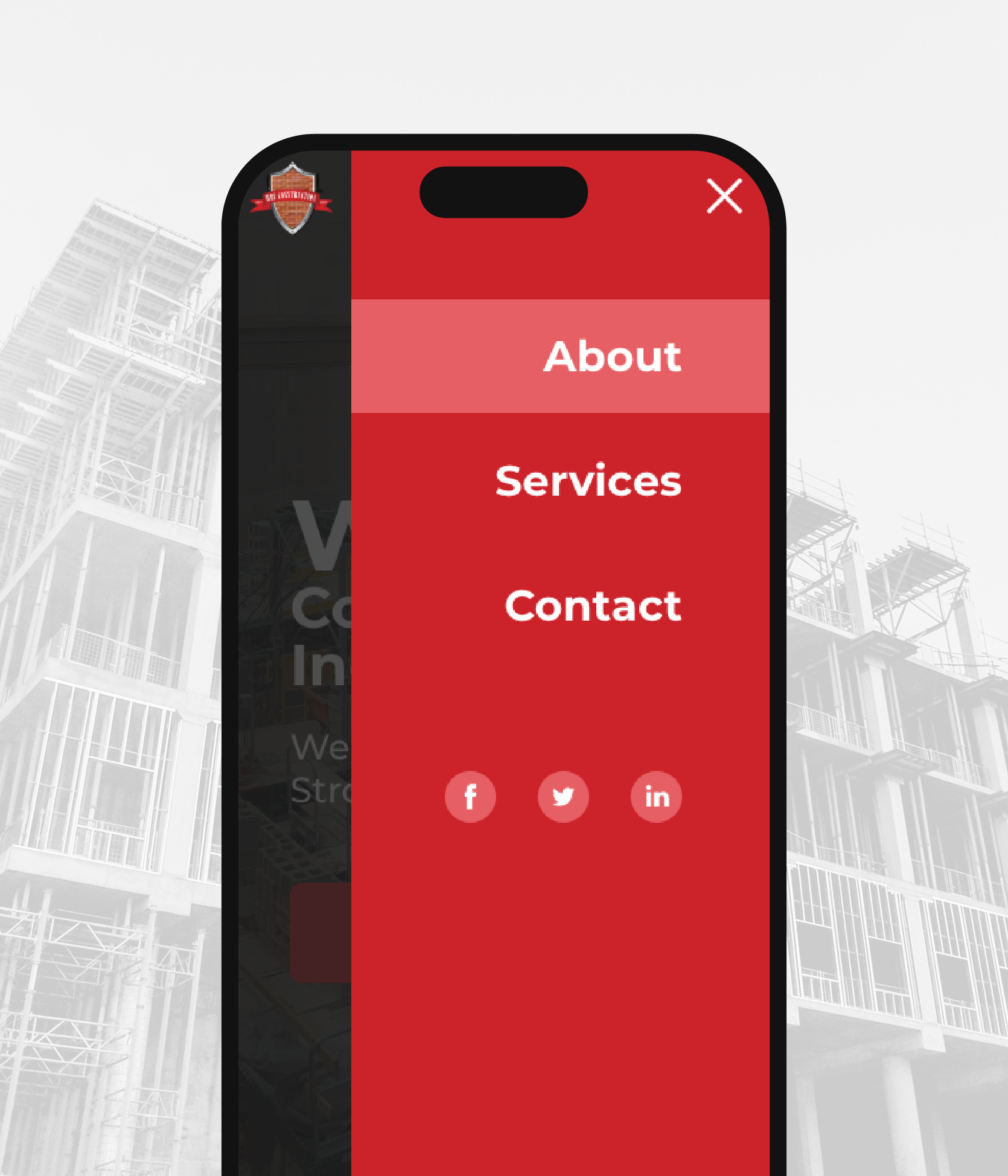
Being a newly established company, W.B.F. Construction, Inc. needed an informational website that would help get their name out there and also showcase their work – with a heavy emphasis on their construction portfolio and company field work. Additionally, W.B.F. wanted to strategically incorporate the colors from their preexisting logo throughout the website, and in doing so, establish an official color palette for the brand. The main objective was to engage with the audience and clearly prompt the users’ trust and familiarity with the way the business operates. It was also important to effectively communicate the level of expertise, commitment, efficiency, and quality that website visitors should expect when collaborating with W.B.F. Construction, Inc.
The Result
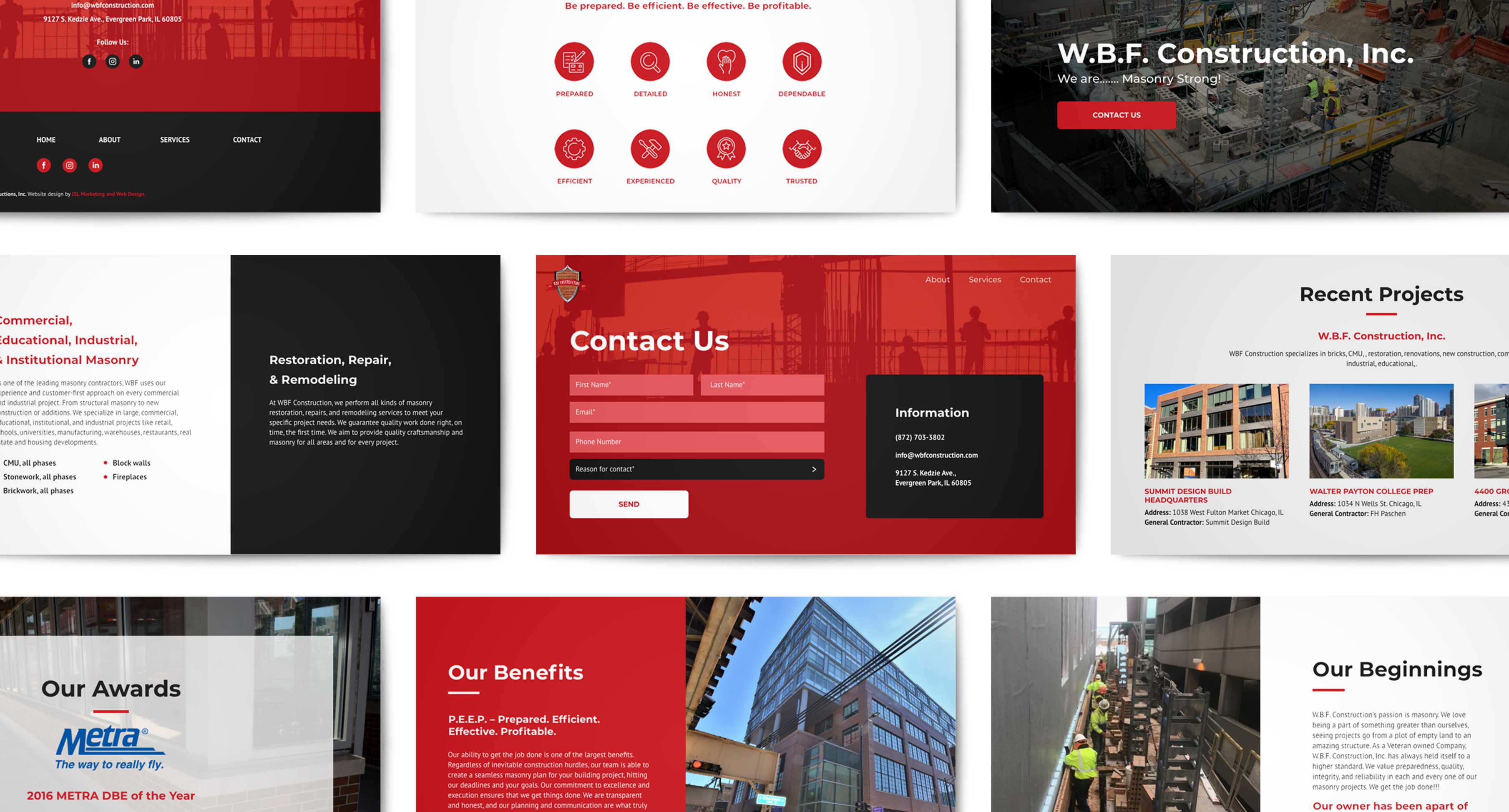
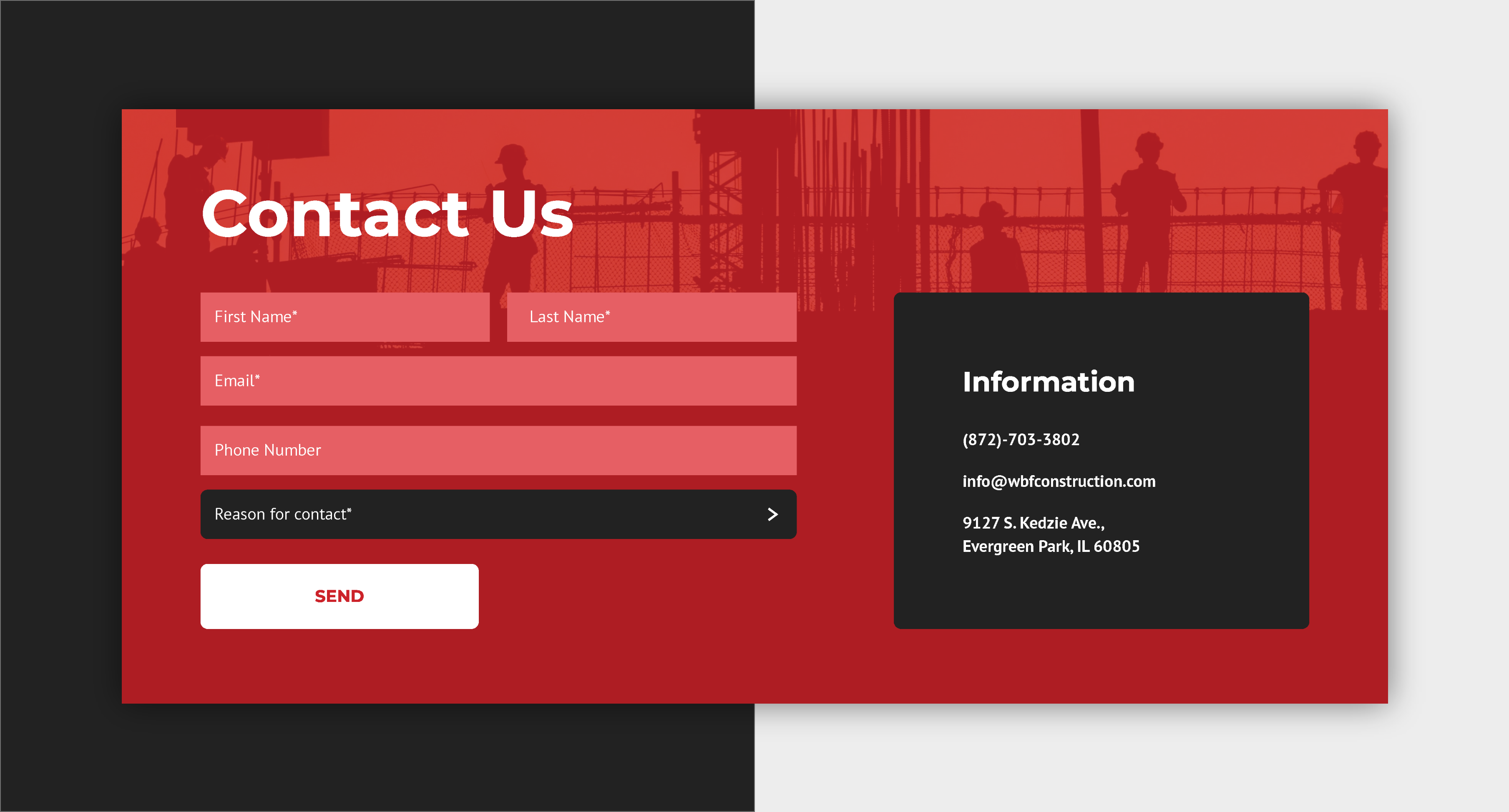
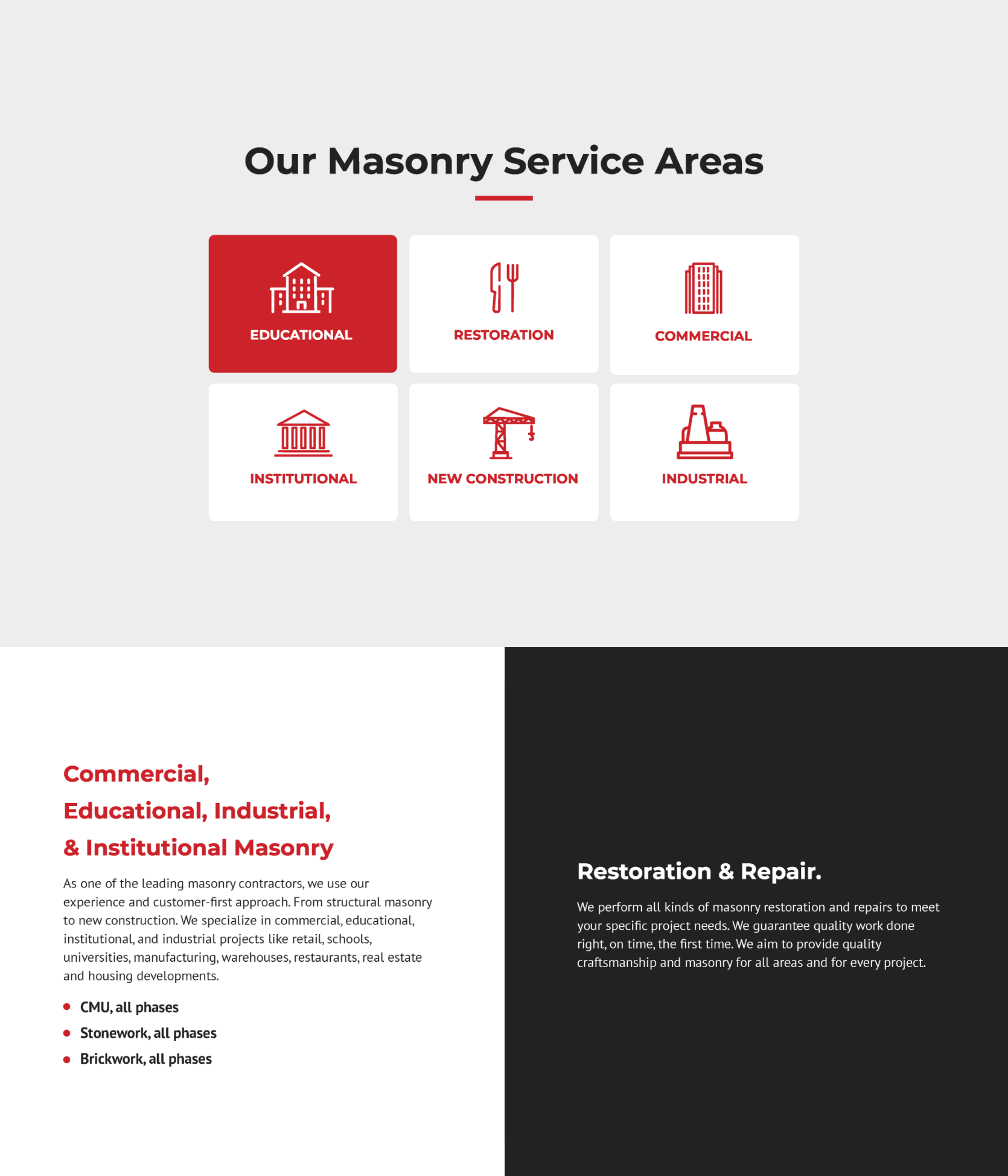
The layout of the new website is simple and to-the-point, but it is animated by subtle yet captivating animations of small graphic elements that are frequently incorporated in the design. This approach, along with the alternating usage of the colors – red, dark and light grey, and white – confers energy, flow, and movement within the website. The images were displayed consistently throughout the site and were, at times, represented as smaller thumbnail images which could be clicked on, allowing the user to view them in a larger format. An additional challenge emerged in structuring the lengthy client and job application forms in a user-friendly way. We ultimately opted to use dropdown menus to select and condense the content so as to avoid excessive scrolling. In the end, the new W.B.F Construction Inc. website met all the client’s requests. The website is effortless, readable, user-oriented, and pleasing to the eye.
Phenomenal company with even better people. I used and still use them today for my start up company. They have been patient and knowledgeable with my team and myself every step of the way. Communicate well and are very timely, too. I’d give six stars if it was an option. Highly recommend.”
NATE T.
CEO of Triumphant Transition Partners

Ready to Start Your Own Project?
We Are Ready and Waiting to Update, Polish, and Shine Your Website!
We love a challenge and making the digital world more functional and beautiful.
Our Portfolio
Want to See More? Check Out More of Our Recent Work!

