About the Company
Disability Advocates of Kent County is a non-profit organization that advocates for handi-capable accessibility within both on and off-line communities.
Headquarters
Grand Rapids, Michigan
Industry
Community, Education, Social Awareness
Services Provided
Content Marketing
Brand Development
Website Design
About Disability Advocates
The mission of Disability Advocates’ is “to work alongside persons with disabilities as they seek to lead self-directed lives.” This is accomplished through the provision of an array of services throughout West Michigan to individuals with physical, cognitive, mental, and sensory disabilities.
The Problem
Disability Advocates faced a difficult challenge. While the purpose of their work is to ensure accessibility for all through community, volunteer work, or even legislation, their own website wasn’t meeting the needs of those they serve. Among a host of problems for Disability Advocates and the community they serve, the site itself was not ADA compliant, making it inaccessible for many of their users.
The site was also vastly outdated, both in form and function. The navigation was disorganized, the styling and design were inconsistent, and the development was not mobile or tablet responsive.
JSL Marketing and Web Design needed a comprehensive and robust plan to address all of their concerns and create a new website that worked well and looked great doing it.
The Process
Content Marketing
One of the main points of updating the design was to create a hierarchy within the content and navigation that was efficient and effective when it came to delivering their message and sharing resources with their audience. Our content marketing team was able to work directly with Disability Advocates’ and their staff to collaborate on their tone of voice, site structure, and format, in a way that would make a positive impact on their users.
Once the content was solidified, our content director was able to pass the copy created on to our lead designer to implement into the new website design.
Brand Development
The original Disability Advocates logo, though well-intentioned, was far too specific for their needs. First, they serve more than just the communities in the Kent County area. And second, their logo depicted imagery that was too specific to mobility-related disabilities. Disability Advocates serves a far broader handi-capable spectrum than their original logo led the average viewer to believe.
The original logo was also difficult to see for those with vision impairment. The faint lettering and the closeness of the colors between gray and teal made it challenging to see and read for many of the people that Disability Advocates serve.
This is what might have led to the multiple versions of their logo. But by creating multiple versions, they lost the original integrity of their logo, along with brand recognition. As an organization built on equity and inclusivity, we needed to make sure they had a logo that was reflective of their core values and would stand the test of time.
Beginning Concepts
JSL Marketing & Web Design starts every branding project off by getting to know you, your company, your message, and most importantly, your “why.” From there, we funnel those core principles into a creative process that transforms your verbal mission into a visual point of focus. That’s what we discussed with the Disability Advocates team and after a two-hour discovery meeting, our team was able to create three strong logo options to present. Take a look at what we created as the first initial concepts for Disability Advocates:
Option 1
Based on the principle of Equity vs. Equality, the platform above “Dis” symbolizes how Disability Advocates provides everyone with the platform and resources they need to succeed. All while emphasizing “Ability” over “Disability.”
![]()
Option 2
For the previous option, we avoided iconography in favor of typographical elements. But to convey the principle of “inclusivity through intersectionality,” we created a minimalist icon depicting a braid or woven fibers.
![]()
Option 3
Our third option aimed to be friendly with an approachable look and feel. The original thought was to make it look like it was being held together by hands as a way to symbolize “support,” but the hands looked a little too cheesy. So, we went with the marks instead.
![]()
The client selected Option Two as the base, and from there, we began a series of changes and fine-tuning calibrations to take the logo concept from an idea to a rough sketch, and finally, to a fully-formed logo and focal point for the brand.
From Concept to Color
With the logo established, it was time to move on to colors. In any branding project, choosing colors is a unique challenge. But in the case of Disability Advocates, their colors had to be more than just eye-catching. We needed to choose an effective color scheme that could accurately represent the brand while fulfilling its primary mission of being accessible and inclusive.
For Disability Advocates’ colorblind and vision-impaired users, the colors needed to be optimized to ensure maximum readability. And even if the user couldn’t determine the colors, the different shades had to be easily distinguishable.
With this in mind, JSL Marketing presented a series of color scheme options, each one optimized for easy readability. We then worked with the client until we came to a blue and orange color scheme. Before finalizing, the staff and potential users tested the colors to confirm legibility.

Website Design & Development
Navigation and Hero
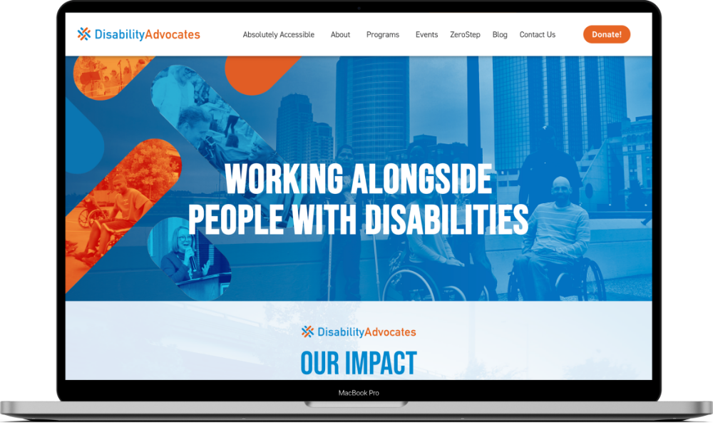
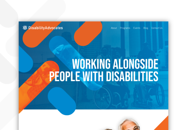
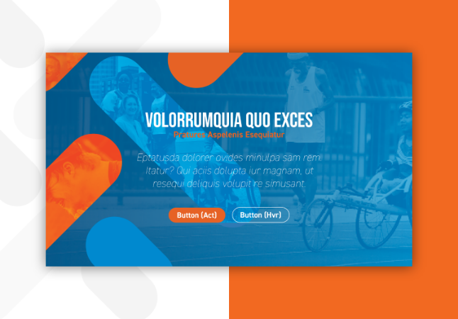
One of the first orders of business for redesigning the Disability Advocates website was to design an effective navigation and hero-header section that would entice and maintain the interest of users from the moment they enter the site. With brand new content and an intuitive site map created by JSL’s lead content director, our design and development team was able to construct a beautiful and easy to understand navigation system that flowed effortlessly from page to page.
Overall Design
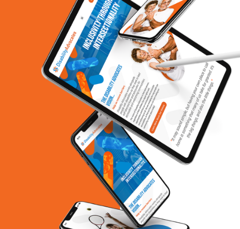
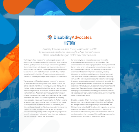
The JSL Team was able to fuse photos and graphical elements from Disability Advocates’ old site, with the new and improved styling that was determined in the branding phase. Buttons were strategically named and placed, text and headings were made larger, and to make sure that it’s accessible for all, JSL made a point of including alt-text with EVERY image on the site to make sure everyone can appreciate the updated design.
Mobile & Tablet Friendly
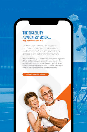
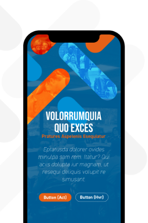
It was our mission to give Disability Advocates and the community they serve a mobile-responsive site, especially since more and more users visit websites from their smartphones.
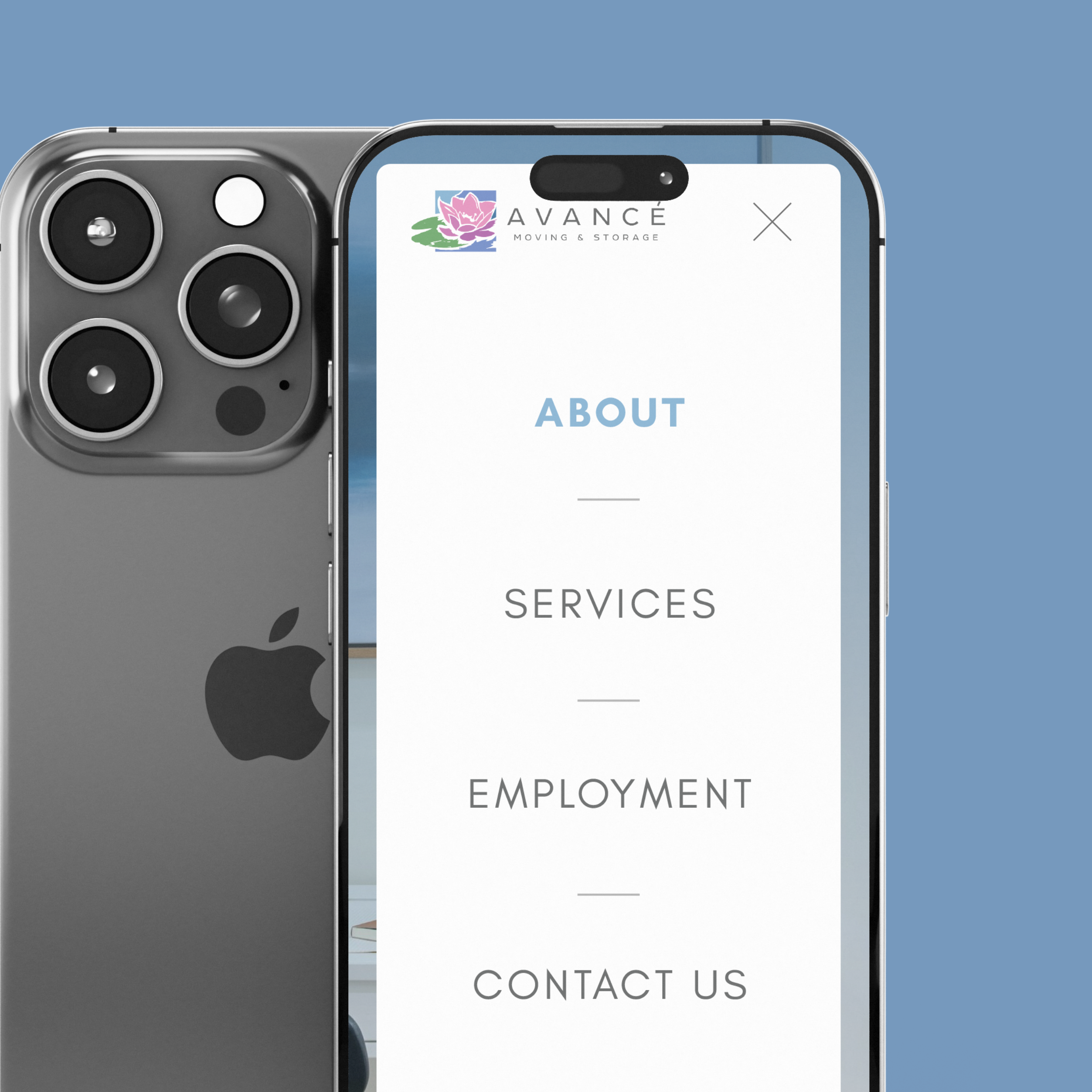
JSL’s web design team took special care to make sure every facet of the design was optimized for easy viewing across all devices, regardless of size, operating system, or model. In addition to creating intuitive desktop version mockup proofs, JSL also presented mobile versions for review. As a team, we discussed functionality and the perspectives of their users to create a site that transitioned seamlessly across desktop, tablet, and mobile platforms.
The Results
By the completion of the project, JSL had successfully rebranded Disability Advocates in a way that drastically reshaped their relationship to those in their community. Their services, information, and resources were more readily accessible and through an interface that both functionally supported and visually appealed to their users. Colors, content, design, and development went through a rigorous process of testing to ensure user-friendliness for all. The new brand reflects a sense of community and the updated colors create an environment of ease, simplicity, and fun.

Ready to Start Your Own Project?
We Are Ready and Waiting to Update, Polish, and Shine Your Website!
We love a challenge and making the digital world more functional and beautiful.
Our Portfolio
Want to See More? Check Out More of Our Recent Work!
