

 877.514.0276
  info@jsl.marketing
Your homepage is more than just another webpage, it’s THE webpage – or, at the very least, it’s your most important web page. And in order to create a successful website, you need to set up the perfect homepage that will interest your users and convert them into customers!
Learn some of our top industry tricks and tips for executing a homepage with stellar UI/UX (user interface and user experience) that also follows the stylistic guidelines to draw the eye and interest your website visitors.
Layout Your Perfect Homepage
The above is a great example of the general layout you should follow for your own homepage. We’ll go through each section briefly:
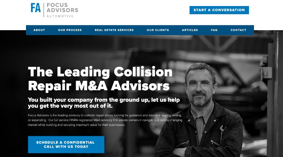
Homepage Banner Image
Your banner image (the image at the top of the screen on your homepage) should not only show what you do, but should be high-quality, match your color scheme, and nod to your area, specializations, or clients.
Logo & Navigation Bar
The top left of your page should include your logo so that your branding is clear, visible, and consistent. Additionally, having a clean and clearly visible navigation bar at the top of your homepage (and all pages) is expected. Meet your web users’ expectations by having your logo, navigation bar, and a contact or ‘action’ button at the top of your page.
Content ‘Above the Fold’
Above the fold is anything you can see on your home page before scrolling down. This should include your Header 1 with relevant keywords (sometimes you can also add a Header 2 in a smaller font) and a short section of content in the smallest font, along with a button – just like the above screenshot.
This keeps the page clean, informative, and clear.
Similar Styles for Homepages


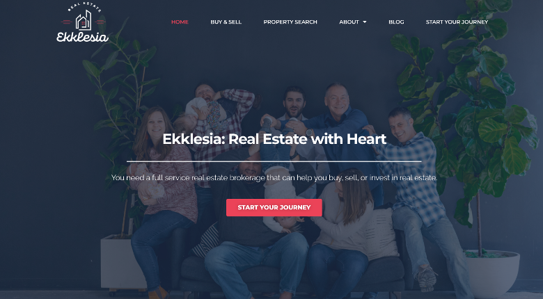

Though these styles vary in color and format, they all have a Header 1 above the fold, their logo and navigation bars, and a clean and clear banner image. Many also have buttons that call the user to do something, additional content, and a Header 2.
Even with these format similarities, there is still so much creativity that you can put into your unique homepage to make it reflect your colors, business, and style.
What to Do Below the Fold on Your Homepage
If ‘above the fold’ is anything you can see without scrolling, then ‘below the fold’ is everything else you see once you begin scrolling.
Remember that your homepage should have a little bit of everything on it, as it is a synopsis of your website and its purpose is to entice your users to view other pages or contact you. That means you should have your services or products, story, history, values, team members, testimonials, a contact form, and more.
See our example below:


Remember, that your web users may only read your headers and skim the rest of your content, so you need to make it compelling and show your value immediately.
Having links and buttons that lead to your other pages and content is helpful as well. And, of course, having a contact form (or a form that captures their information) is the point of your website!